
Image Gallery Configurations
The Page Builder element Image Gallery allows the insertion of an image gallery in any page.
The image gallery can be configured in a thumbnail grid format or a single thumbnail representing the gallery. When you click the thumbnail, the image is displayed in larger format in an overlay.
Image Gallery Grid Example
Example configured in a grid of 5 columns, 15px gap, mouse over color green, 100% width.
Container settings configured with light green background, padding all around.

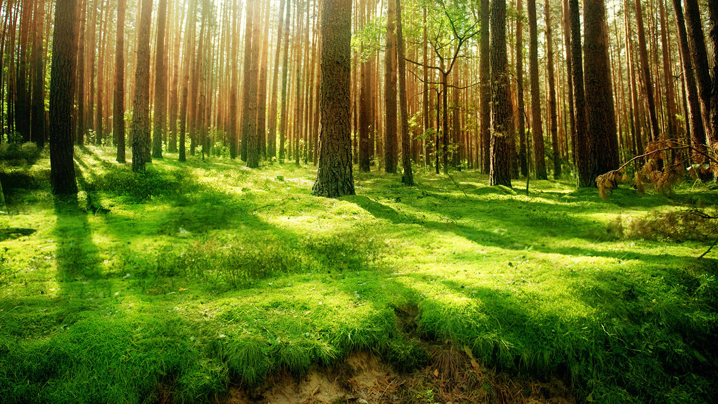

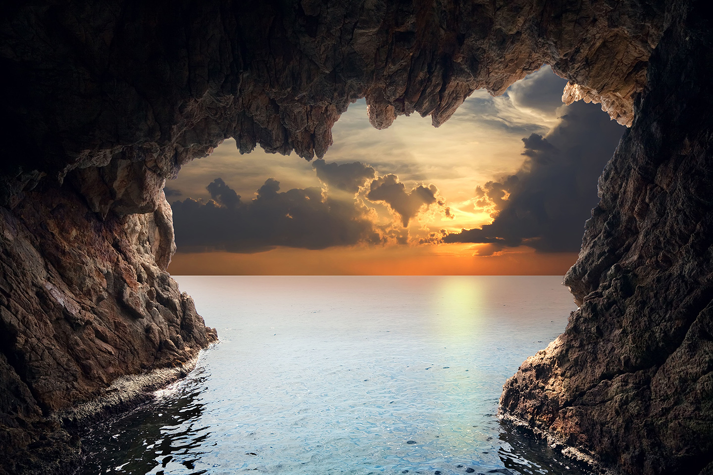
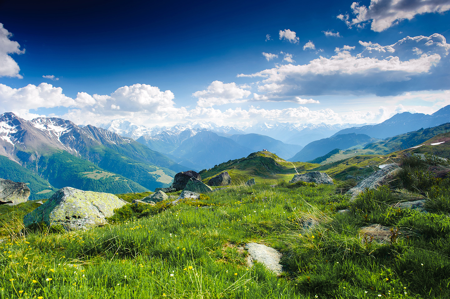

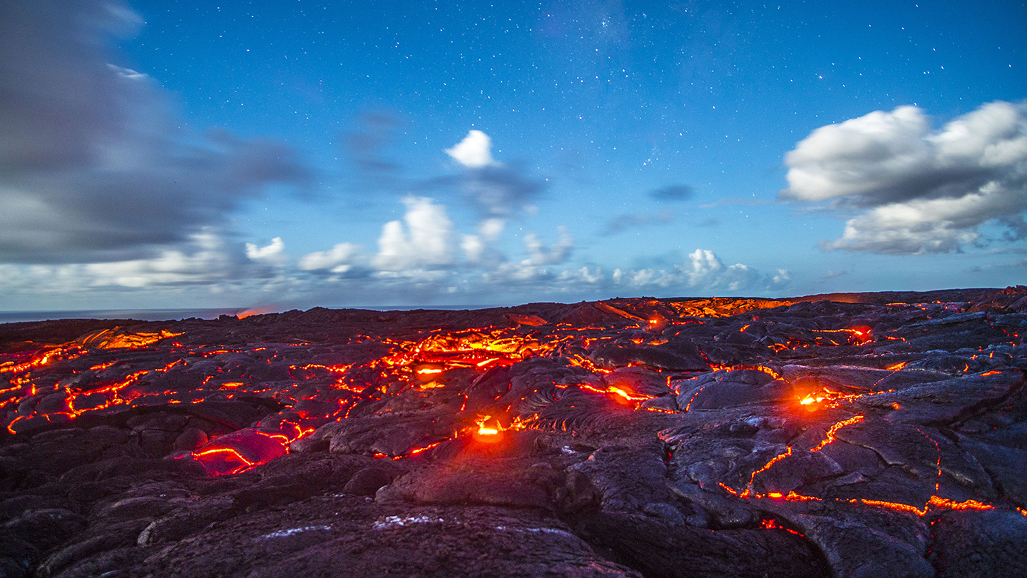
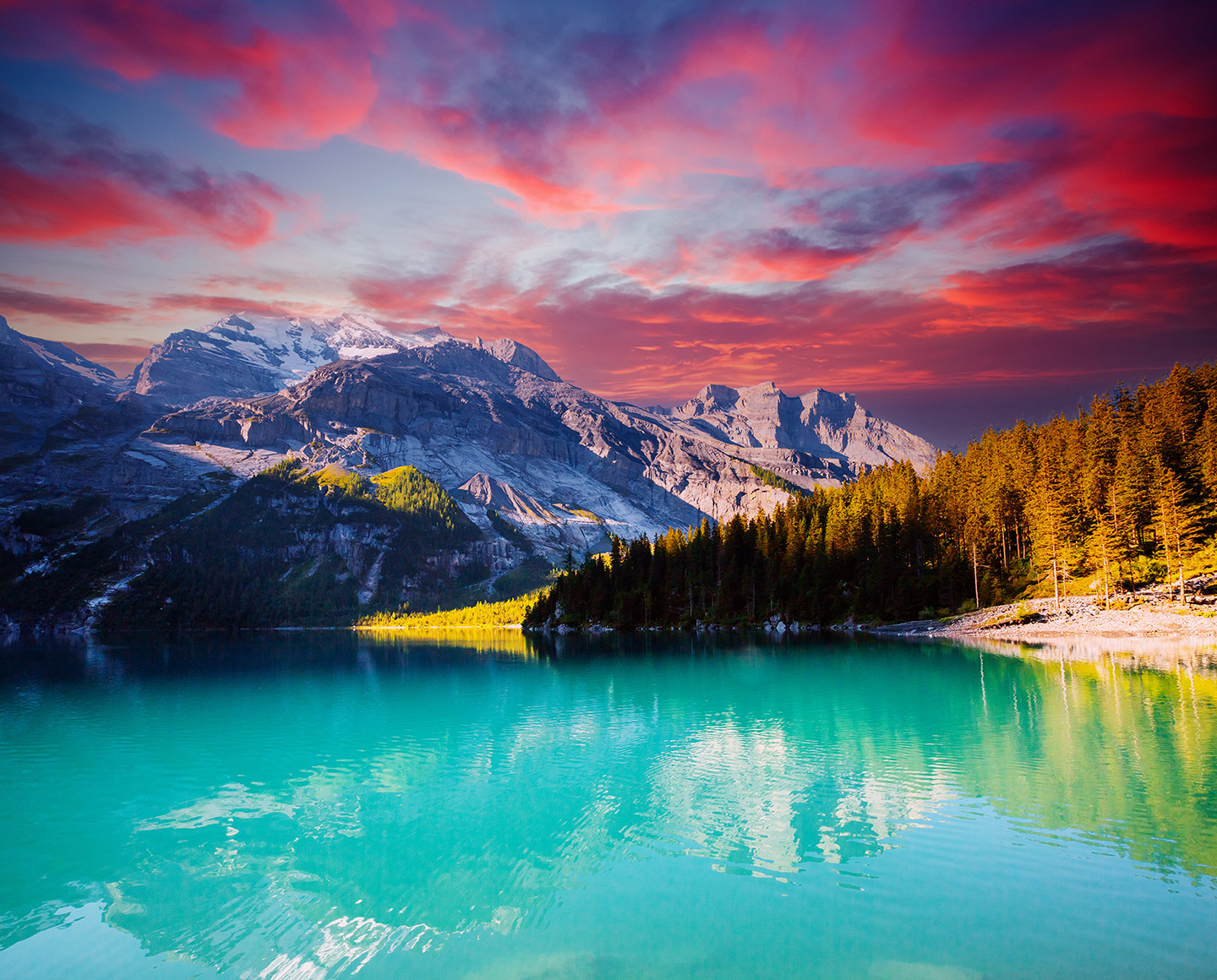

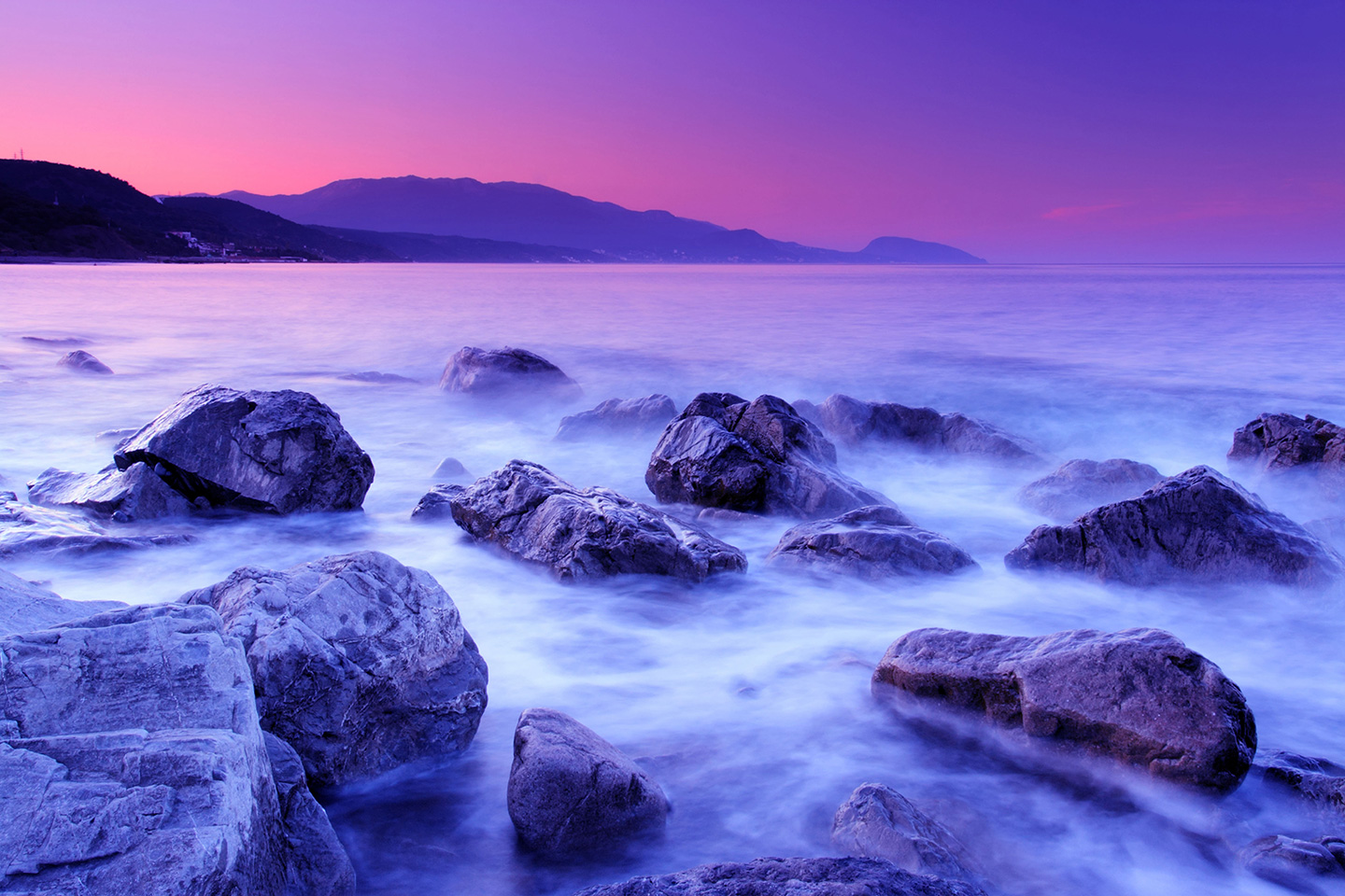

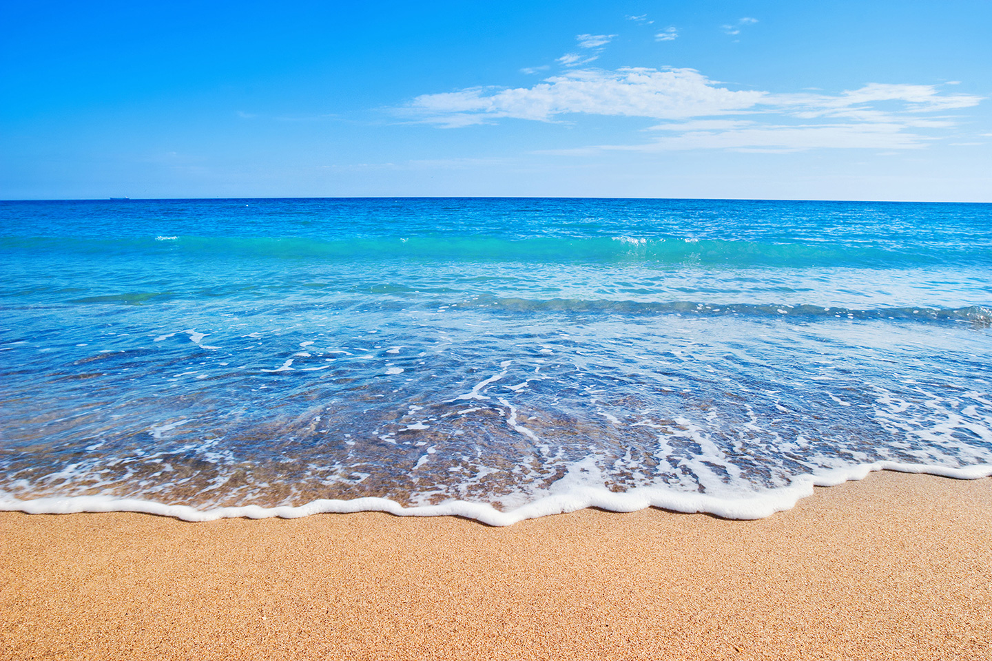
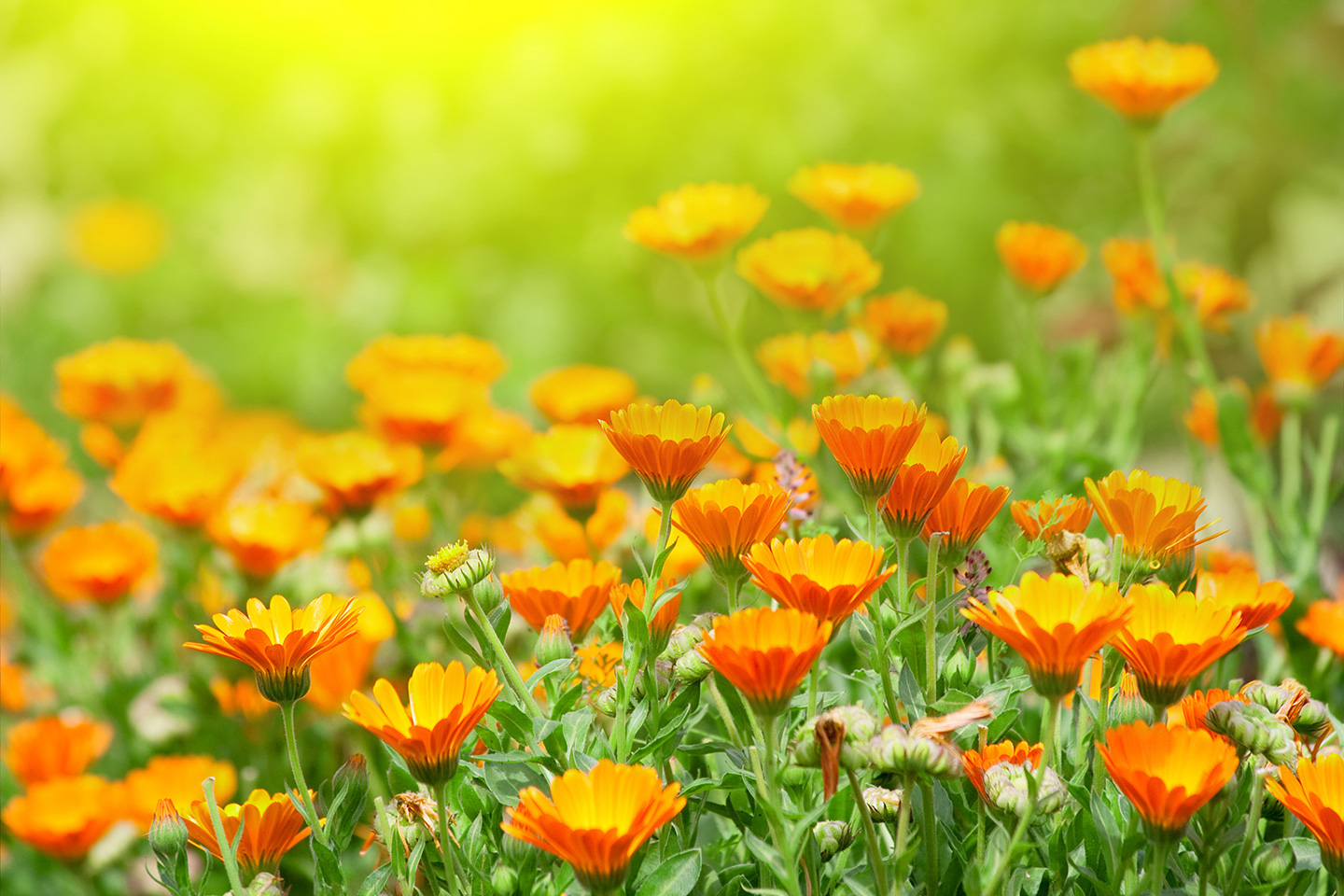

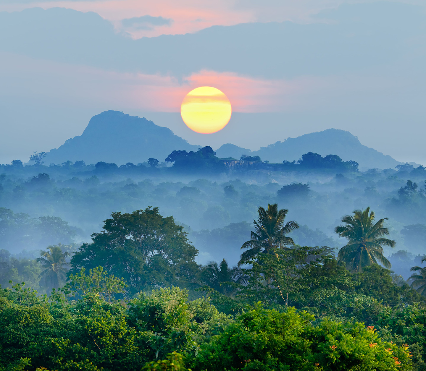
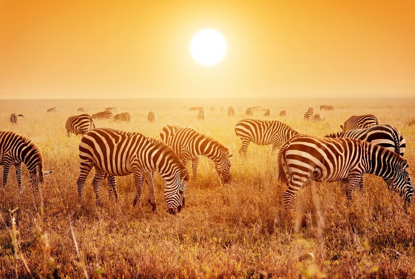
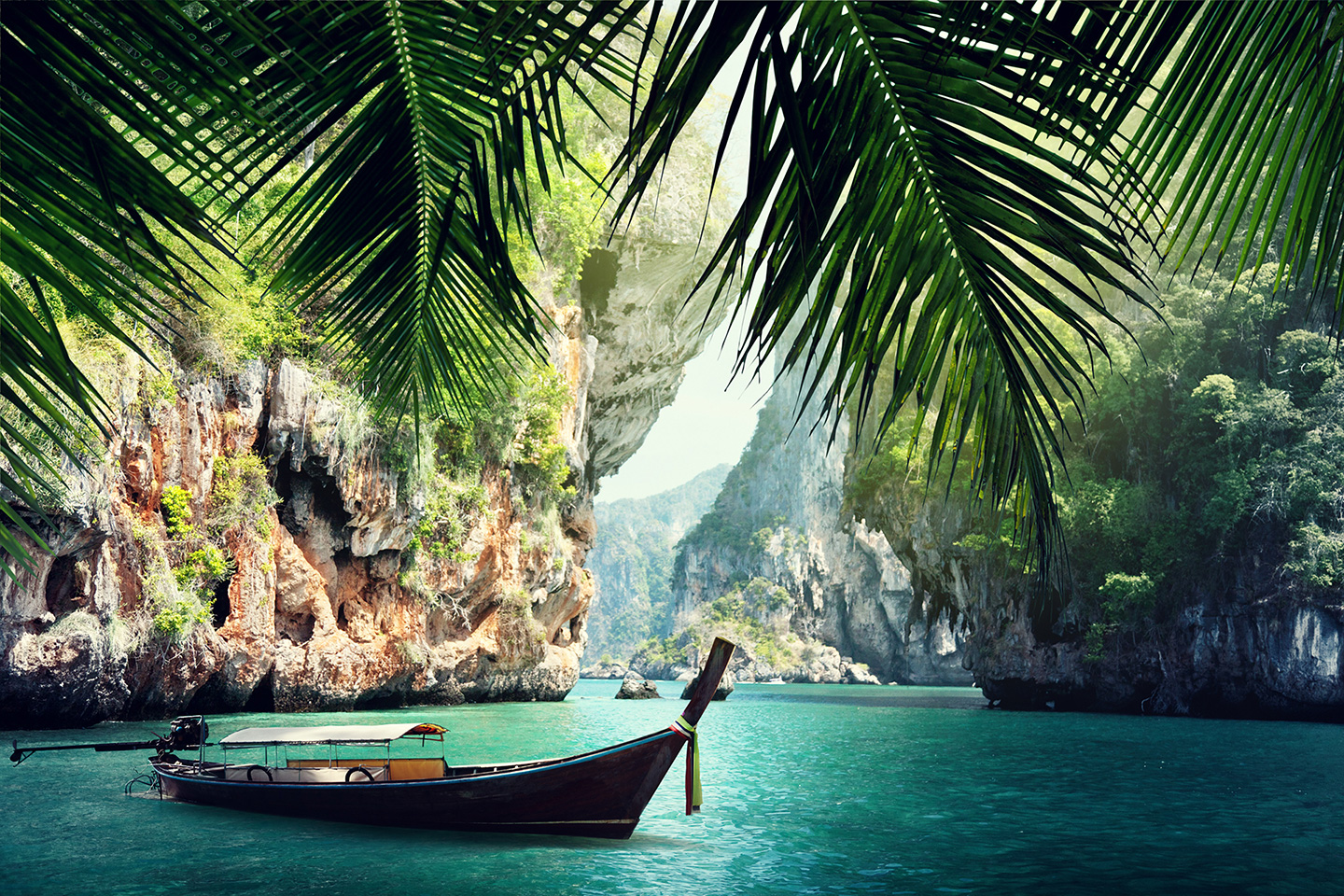

Image Gallery 02
Click to enlarge.
Use with Simple Content
This example is a combination of a Simple Content component with an Image Gallery component.
The Simple Content creates 2 columns with text in the first and an Image Gallery inserted in the second column.
The Image Gallery on the right uses a display layout Single Image.
This allows adding an Image Gallery in a page in a compact format. This example was configured with a mouse over color set to Orange. When the display is set to Single Image the settings for number of columns and column gap are ignored.
Configurations
Image Gallery Component
- Title
- If title should be displayed on the page
- An introduction text
- Layout (grid | Single image)
- Number of columns in grid layout
- Column gap
- Color style
- Placement (inline, top of page content, bottom of page content, etc.)
- Width as percentage of the total width available for the element
- Container Settings
Container Settings
Container settings allows the configuration of the container housing the component. It allows the following settings:
- Padding (in px): top, right, bottom, left. Defaults to 0px for all.
- Margins (in px): top, right, bottom, left. Defaults to 32px in the bottom.
- Border (in px): top, right, bottom, left. Defaults to 0px for all.
- Border Radius (in px): defaults to 0px.
- Border Color
- Background
- Color
- Text Color
- Extend text color to items or not
- Opacity (%)
- Blur (in px)
- Media (image / video)
- Parallax Effect (for Image only)
Image Gallery Item
- Title
- Images
- For each Image:
- Image
- Title
- Alt text
- Crop